Let's get in touch
Contact us for more information or a quote.
1 febbraio 2021 - News
Sticker Advertising: 7 Tips for Creating Them

Thinking of stickers as just toys for kids and teens is a mistake. Stickers work for all ages, are versatile, and make a strong impact. Today, advertising with stickers is smart.
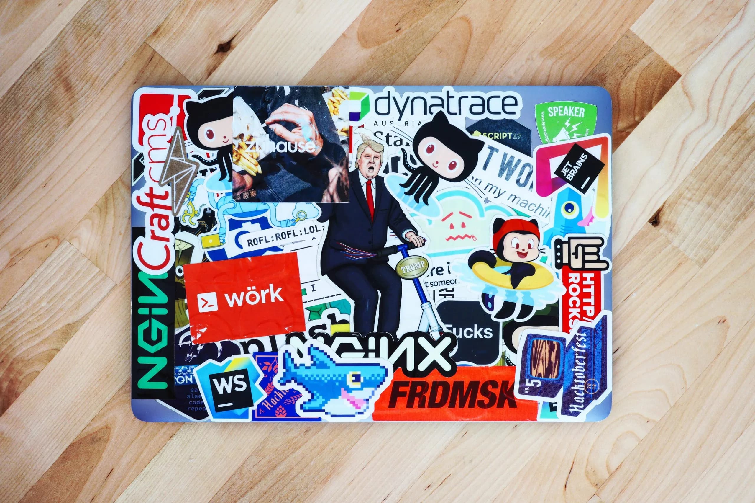
It seemed like a trend of the past. Yet stickers are back, even in advertising. They are ideal for spreading a brand, logo, or message: lightweight, small, easy to apply almost anywhere, and immediately visible. We’ve seen stickers on shop windows, car glass, diaries, or closet doors. But a sticker must catch the eye and be attractive. Here are some tips to create a winning sticker.
1. Simplicity and clarity
A sticker differs from a logo, but follows the same rule: it must be immediate. Considering its small size, the image, colors, shape, and message must be well thought out. Avoid overloading information; other materials like websites, brochures, or flyers can elaborate further. A sticker appeals to quick emotions, so it must be recognizable, impactful, and decisive. Start by defining the message and how to convey it concisely, using a word or shape without confusion. It should also be visually attractive and harmonious in shape and color.

2. Identity
Stickers are often used creatively for advertising, differently from posters or postcards. You can print a logo on a sticker, but unless it’s artistic, people may not attach or keep it. Communication is more subtle: a sticker should be beautiful and engaging while maintaining identity, and ideally link to an official source. If it’s not possible to include recognizable shapes, words, or a website, a QR code is a great solution, even for small sizes.
3. Choosing colors
As with logo design, sticker colors should reflect the brand, its story, and values. Stickers must be part of an integrated visual language, so the brand “family” is immediately recognizable. If the sticker doesn’t show the logo, colors and fonts from the main brand can be used to make it unmistakable. Colors are preferably those of the logo or website, mixed into new images or words.
4. Sticker shapes
The beauty of stickers is their versatility. Square, rectangular, or round stickers are easiest to make and apply, but digital printing today allows any shape or die-cut. Avoid overly complex cuts or thin parts that might break or peel, especially on irregular or curved surfaces.

5. Size
A sticker works best small. It should be easy to handle, distribute, and apply, without being intrusive. The ideal is palm-sized. Tiny stickers must be very simple with minimal graphics or text, like a word or smiley face.

6. Clear, readable text
Stickers often have little or no text. If text is included, it must be legible, with a simple, linear font. Contrast colors well to highlight words. Bold text is recommended.
7. Printing tips
Designing a sticker is not easy. Achieving clarity, identity, harmony, and beauty requires attention. Ideally, involve a designer or creative professional. For DIY, use high-resolution files, preferably vector. A secondary version can be a lower-res JPG. Consult a professional for materials, finishes, adhesives, and quantities. The material must stick to most surfaces without damage, removable without residue. And always produce extra copies: some may be miscut, damaged, or so popular they run out quickly!
This site is protected by Google reCAPTCHA v3, Privacy Policy and Terms of Service.