Let's get in touch
Contact us for more information or a quote.
8 novembre 2023 - Approfondimenti
Printing Techniques: Typography
The Ancient Art of Arranging Type: How Typography Has Shaped Printing for Centuries
STo write by means of an imprint — that is the meaning of the term typography, derived from the ancient Greek words Týpos (“imprint”) and Gráphein (“to write”).
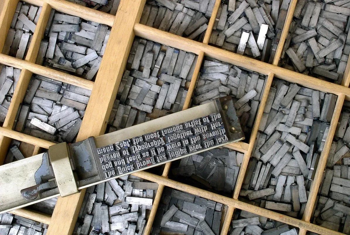
Around a thousand years ago, between 1041 and 1048, a Chinese inventor named Bi Sheng created terracotta characters which, when assembled, formed a text. Once inked, these characters — sometimes made of wood — were pressed onto surfaces to transfer the chosen text. It was through Bi Sheng’s technique that typography was born.
However, it would take several more centuries for the method to spread widely. Around 1455, Johann Gutenberg used movable type printing to produce the famous 42-line Bible (named after the number of text lines per page). From that moment on, movable type began to be made of metal.
Pressed onto paper by means of a printing press, these variable-shaped metal blocks bearing specific letters became, for a long time, the key components of the most widely used printing technique.
The Renaissance fervor soon allowed this technique to spread rapidly, inspiring the creativity and inventiveness of others — among them, Aldus Manutius, who, by designing characters slightly slanted to the right, created the Italic style. The year was 1501.
The Industrial Revolution of the 19th century later introduced clichés or stereotypes (from which the term stereotyping derives) — metal plates reproducing an already composed page to be printed onto paper. These tools, the clichés, are still used today by printing companies.
Original period zinc plates from the companies “Pirelli” and “Satura”
In the world of labels, clichés are used in the creation of certain embellishment techniques, which enhance a label or specific parts of it, such as a logo. The section to be highlighted depends on the type of message one wishes to convey.
Indeed, the transfer of type onto a surface naturally follows the choice of the typeface itself. In this sense, the term typography is often confused with the design or selection of typefaces. The wide variety of fonts available — just think of how many there are in modern word processors like Microsoft Word — reflects the range of nuances that can be attributed to the intended message.
In the past, Gutenberg’s Bible needed to be printed in a way that respected the essence of Christian language and values, tailored to the society of that time. Likewise, today, anyone seeking to communicate a message to a specific audience must consider similar aspects — choosing the typeface that best conveys both the message and the identity of the one who “writes.”
Since the invention of clichés, typography has taken countless further steps forward, driven by mechanization, which in the 19th century led to the invention of rotary printing — enabling thousands of copies per hour to be printed on a continuous roll (now known as a web) of white paper. Another milestone invention was four-color printing, also known as CMYK.
Finally, in the last century, information technology became the true driving force, guiding the industry toward digital printing.
The Typeface

In typography — and today also in computing — a typeface refers to a set of characters sharing a specific graphic style and used to fulfill a particular function. Typefaces should not be confused with the term font, which refers to specific collections of files used in word processing programs.
To achieve a precise and distinctive graphic style, typefaces possess a set of characteristics that make them unique, influencing both their readability and visual impact. The main characteristics of typefaces include:
Style: Refers to the overall form of the type. Choosing between italic, bold, regular, underlined, and so on determines the style applied to the type. Each style conveys a different visual impression.
Serifs: Small extensions at the ends of the strokes. Typefaces can be serif or sans-serif. Serif typefaces tend to appear more traditional and are often used in long texts, while sans-serif typefaces are usually considered more modern and suitable for digital use.
Spacing: The spacing between characters is called kerning and is important to ensure that letters are balanced and readable. Tracking refers to spacing between words, while leading refers to the spacing between lines of text.
Stroke Width: Refers to the thickness of the lines forming the characters. Typefaces can have thin or thick strokes, which obviously affects the overall appearance of the text.
X-Height: The x-height measures the distance between the baseline (where letters sit) and the top of lowercase letters, calculated based on the height of the letter “x.” This measurement is important as it influences readability and the proportion between uppercase and lowercase letters.
Cap Height: The height of uppercase letters, representing the distance from the baseline to the top of capital letters.
Line Length: Refers to the width of a block of text or paragraph. Maximum line length is chosen according to a specific typographic design. If lines are too short, the text may appear disjointed; if too long, reading rhythm suffers, and the reader has more difficulty locating the beginning of the next line.
Inclination: Refers to the angle of letters in italic or oblique type.
Letter Shapes: The shapes of the letters themselves are a defining characteristic of each typeface. Some typefaces feature curved, soft lines, while others have straight lines and sharp angles.
Special Characters: Many typefaces include special characters such as symbols, numbers, and punctuation marks, which can vary widely between typefaces.
As illustrated, the factors defining a typeface are numerous, and choosing which type to use is far from trivial. The purpose of the message, the context in which it will appear, the desired readability, and the intended visual impression are all factors that give depth and weight to the chosen message.
This site is protected by Google reCAPTCHA v3, Privacy Policy and Terms of Service.