Let's get in touch
Contact us for more information or a quote.
31 agosto 2020 - News
Ilma Etichette will compete at the Fedrigoni Top Award 2021

Four projects, developed in collaboration with ArtevinoStudio, combine creativity and technology. The award ceremony took place in spring 2021.
Ilma Etichette took part for the first time in the Fedrigoni Top Award, a competition that showcases the most prestigious printed works (using any printing technique) produced on Fedrigoni and Fabriano specialty papers, as well as on Manter self-adhesive materials by Arconvert.
In the Labels category — dedicated to labels for wines, spirits, and high-end food products — Ilma Etichette and ArtevinoStudio presented four projects that exemplify the perfect fusion of creativity and advanced printing technology.
Folium

The Folium label project, born from the collaboration between Ilma Etichette and ArtevinoStudio, focuses on the uniqueness of every wine label.
Thanks to HP Indigo digital printing technology, it was possible to experiment with variable data printing, creating countless one-of-a-kind labels — each differing by a single detail or color combination while maintaining a consistent overall style.
Every design plays with dominant color variations and recurring graphic elements to distinguish products within the range. Despite the infinite visual combinations, the label remains immediately recognizable.
A leaf-shaped die-cut, Braille embossing on the brand name, and Detaluxe© copper foil finishing are the distinctive features that make every Folium label unique and identifiable.
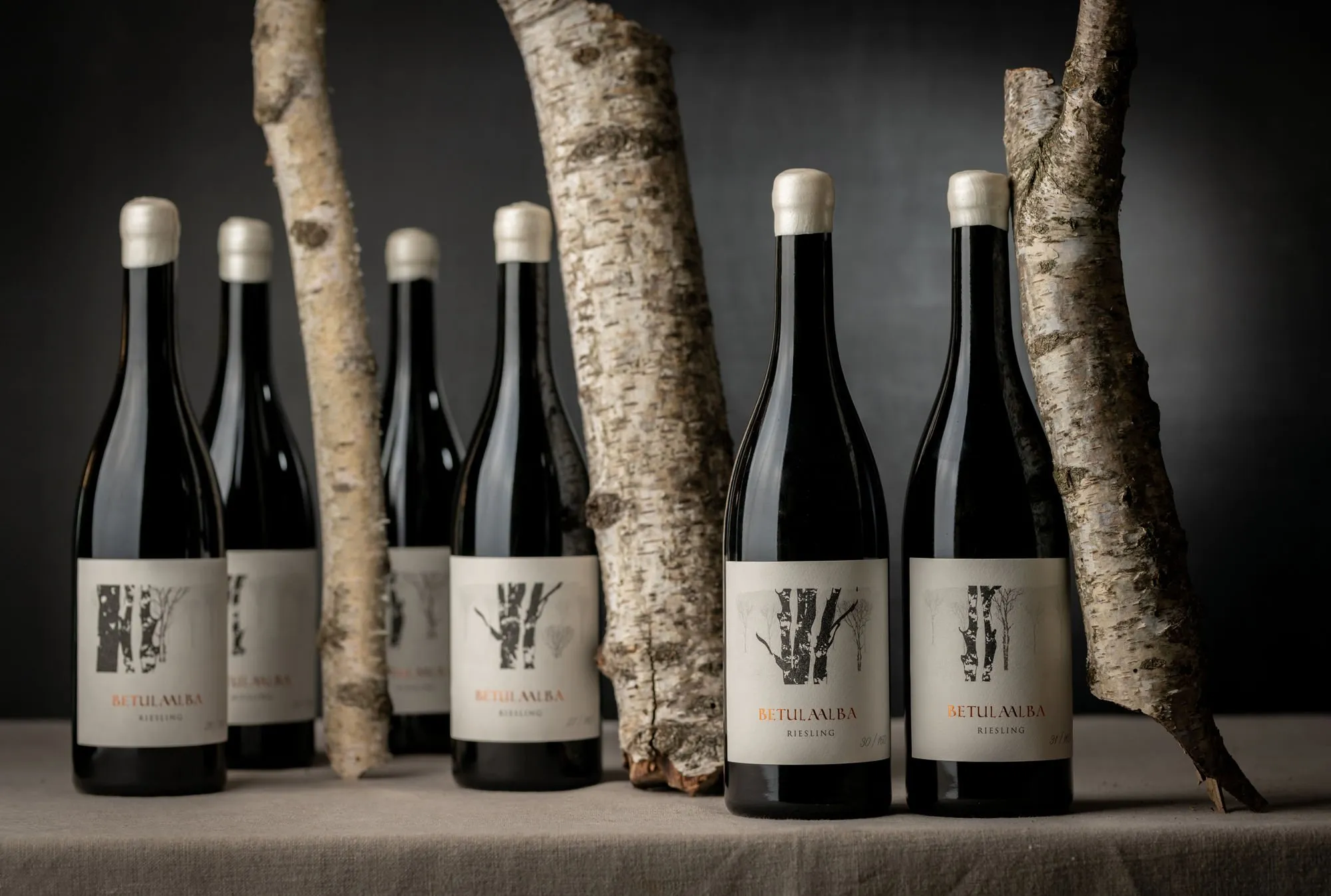
Betula Alba

Following the same creative concept comes the Betula Alba label line, also developed in collaboration with ArtevinoStudio.
Using HP Indigo digital printing enhanced by the SmartStream Designer software, the project explores variable graphic functions through two techniques:
-
Collage, which generates unique illustrations by combining and reworking one or more images.
-
Variable data printing, which enables progressive numbering of each label.
The result is hundreds of unique, individually numbered labels — each distinct yet stylistically unified. The imagery, featuring an elegant birch forest, perfectly matches the refined identity of a premium wine.
Details such as the Kurz Luxor Alufin 396 copper foil and Fedrigoni Arconvert Cotone Bianco paper elevate the final product, while the numbering enhances the sense of exclusivity and craftsmanship.
TerraVita

The third project, designed for TerraVita, celebrates the winery’s deep connection to its land in Suvereto, Alta Maremma Toscana, where the wines Aimat and Solerica are produced.
These labels combine meticulous printing precision with a creative design that symbolically represents the territory and its roots. Printed in four-color HP Indigo digital printing on Fedrigoni Tintoretto Gesso UWS paper, the labels feature a house at their center — a symbol of identity and belonging.
Emerging from the earth yet remaining part of it, the house is created through an interplay of two die-cut layers, representing the unity between land and home.
The image comes from the “Landscapes of the Soul” sculpture series by Japanese artist Kyoji Nagatani, evoking the idea of a land that rises yet remains deeply rooted in its vineyards.
Podere Sottoilnoce

Artistic and deeply personal, the labels created for Podere Sottoilnoce feature ink drawings by illustrator Denis Riva, portraying a majestic nature before which humankind stands humbly.
Printed in four-color HP Indigo digital printing on Fedrigoni Tintoretto Gesso UWS paper and enriched with silkscreen details, the labels wrap around the bottle in a horizontal layout — starting with the illustration on the left and continuing to the right with the Podere Sottoilnoce logo and the brand philosophy.
Each label becomes a small narrative — a visual journey that unites art, territory, and identity.
This site is protected by Google reCAPTCHA v3, Privacy Policy and Terms of Service.