Let's get in touch
Contact us for more information or a quote.
21 luglio 2021 - Approfondimenti
I vini (e le etichette) di Di Francesco-Gasperi Vino & Spiriti
Studying a label means understanding the client’s needs — but also enhancing their story and values.
The case of Di Francesco-Gasperi Vino & Spiriti wines.
A wine born from deep passion and dedication.
“With plenty of swearing and an equal amount of passion, we managed to get started — to embark on our adventure in the world of viticulture. We listened to everyone who knew more than we did, made almost every possible mistake, even by listening too much to others. But in the end, we managed to get it right.”
The vineyards and wines today
Today, Di Francesco-Gasperi Vino & Spiriti’s vineyard covers one and a half hectares of the Saint-Pierre terraces overlooking the Priory, all cultivated strictly by hand. The production includes 3,000 bottles of Petite Arvine, 1,500 bottles of Fumin (pure), and 1,500 bottles of Planchettes (a blend of 90% Petit Rouge and 10% Pinot Noir).
“Our wines faithfully reflect each climatic season, without significant intervention in the cellar.”

When the labels were no longer working
“During lockdown, there were evenings when I’d drink my own wine and realize that something about the bottle’s aesthetics no longer convinced me,” explains Stefano Di Francesco. “It was the labels — they lacked something that truly represented us.”
That global economic pause became a moment of introspection and reinvention.
“We contacted Ilma Etichette—who had previously worked with us. Together with their team and the designers at Artevino Studio, we found a new visual identity for our bottles,” Stefano concludes with satisfaction..

The creative process
“The designers guided us through a complex process of ideation and brand definition. It was an intense journey because, beyond the purely visual aspects, we had to work on our values—on what truly makes us who we are,” says Stefano.
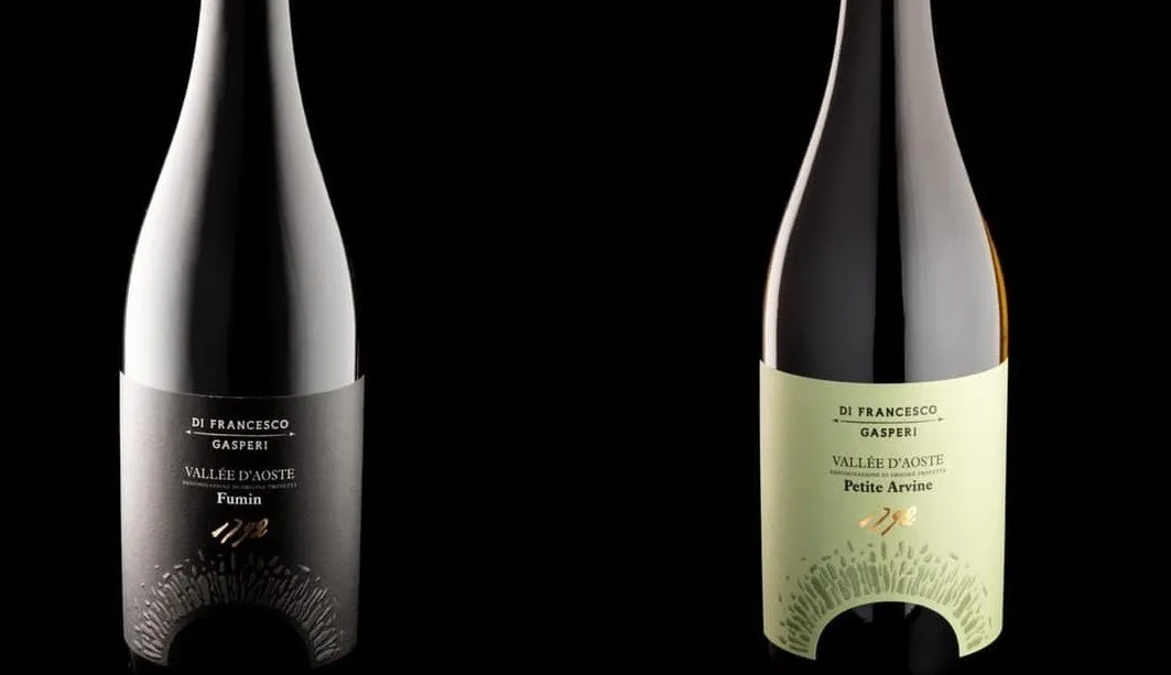
The graphic proposal came after careful research into the Di Francesco-Gasperi Vino & Spiriti story and website. Elements from the previous labels were reinterpreted: the arches, the stones, and the date 1792 (engraved on an ancient stone found in the vineyard—testimony to its heroic heritage).
“The symbols that already represented us were redesigned to be more refined, modern, and elegant. We rediscovered our story, and these new labels tell it beautifully.”
A technique to renew the past
The labels for Di Francesco-Gasperi Vino & Spiriti—whose wines have recently entered the U.S. market—are truly unique, enriched with special printing techniques and embellishments created by Ilma Etichette based on Artevino Studio’s design.
The Braille embossing on the logo and the stones enhances these key elements, while the gold foil highlights the “1792” inscription. The paper used is Fedrigoni-Arconvert Materica Gesso ultra WS.
“When we began working on the new labels,” comment the designers at Artevino Studio, “we immediately searched for visual elements that could represent the brand at a glance—something distinctive and unique. Being in Valle d’Aosta, we could have drawn inspiration from the stunning mountains surrounding Saint-Pierre or from the characteristic planchettes terraces, where viticulture becomes truly heroic due to the steep slopes.”
Then came personalization
“But something was still missing,” they continue. “We needed to personalize the design—to celebrate the history of the place, the company, and its journey through the years. The earlier labels featured an illustration of a stone arch, like the one found during the restoration of a vineyard, bearing the engraved date 1792 on its keystone—a historical trace of ancient vines once planted in the area.”
“The choice to make this element central came naturally: it is consistent with the brand’s story and strongly representative of its identity. The arch is simplified and enhanced by Braille embossing, emphasizing the individual stones—a metaphor for building one’s own history. The arched die-cut beneath the stones invites the viewer to explore the depth of the wine. At the top, the 1792 in Kurz Luxoro Alufin 425 gold foil adds a touch of light that illuminates every label—just as the Di Francesco-Gasperi arch lights up the Saint-Pierre hillside at night.”
This site is protected by Google reCAPTCHA v3, Privacy Policy and Terms of Service.