Let's get in touch
Contact us for more information or a quote.
18 gennaio 2021 - News
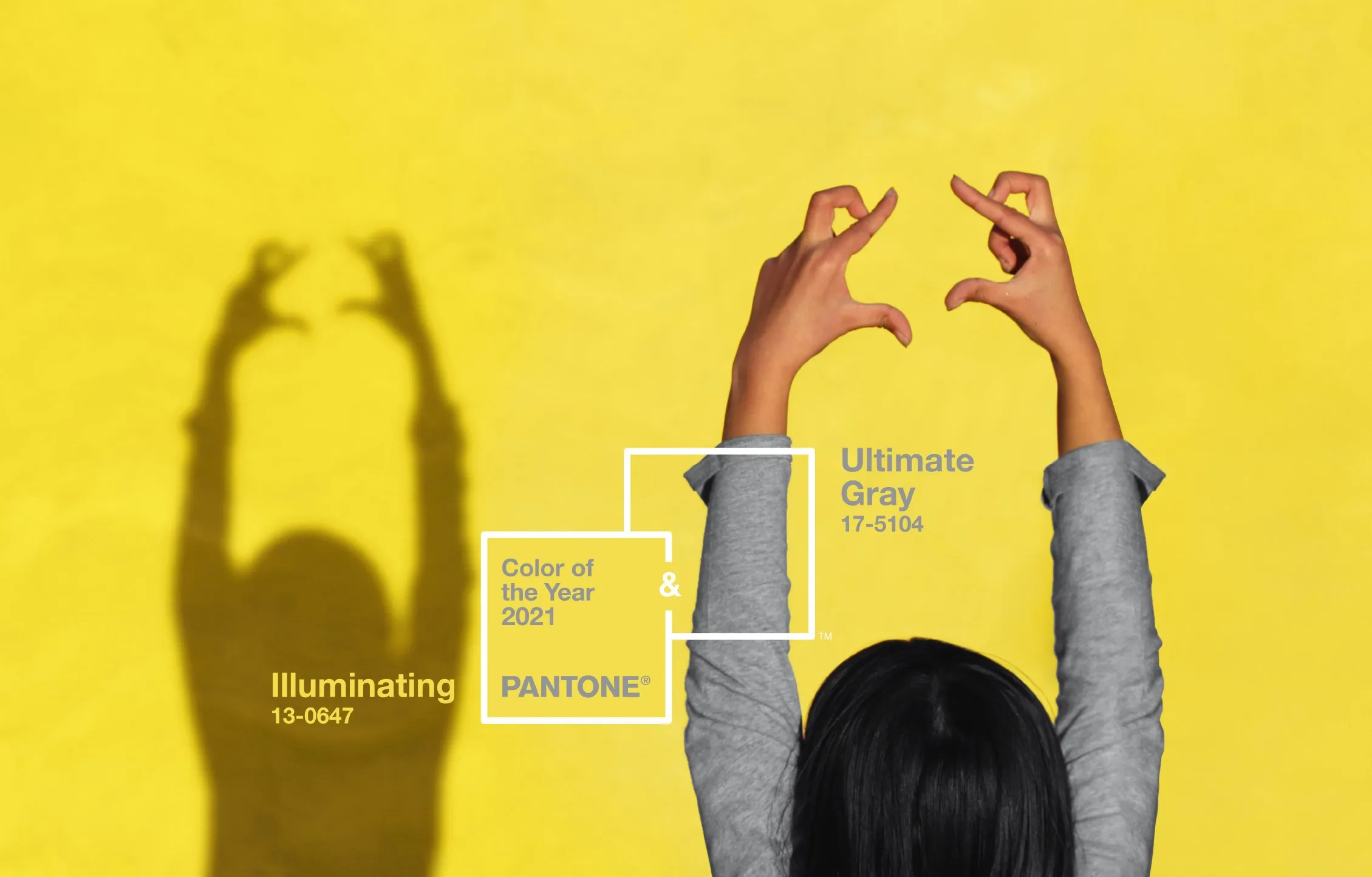
Pantone 2021: Two Colors—Gray and Yellow for Optimism
I colori PANTONE® 2021 sono due: “Ultimate Grey” e “Illuminating“. Un grigio brillante e un giallo, che insieme trasmettono forza, unione e ottimismo. Ecco la scelta del PANTONE Color Institute per la tendenza 2021.
The PANTONE® colors for 2021 are two: Ultimate Grey and Illuminating. A bright gray and a yellow that together convey strength, unity, and optimism. This is the choice of the PANTONE Color Institute for the 2021 trend.
As every year, the verdict from the PANTONE Color Institute, the renowned American color authority, has arrived. The institute proposes palettes rich in colors, shades, and combinations, and after careful analysis, it identifies the trend for the year. For 2021, the institute chose not one but two trend colors: Ultimate Grey and Illuminating.
Pantone 2021 Colors to Convey Strength and Optimism
After a particularly difficult and subdued year, a dual-color approach was chosen for 2021. Two colors that strengthen each other in various combinations and adapt to different contexts, conveying a sense of strength and optimism with intelligence. “A timeless and encouraging color pairing that communicates strength and hope,” commented Leatrice Eiseman, Executive Director of the institute. The combination is not excessive but radiates energy. “Solid and dependable, warm and optimistic, this pairing conveys resilience and hope. We need to feel encouraged and uplifted—this is essential for the human mind,” Eiseman added.
Gray and Yellow: The Trend
PANTONE® 17-5104 Ultimate Gray + PANTONE® 13-0647 Illuminating are the PANTONE 2021 colors. The gray is a full, bright tone—neither too light nor too dark. The yellow is pure, not muted and not overly bright. This pairing has been seen before, reminiscent of Northern Europe. It has already been used in design and interior decoration, from walls to furniture accessories such as lamps and curtains. The combination has also appeared in fashion collections. PANTONE® now revives it to convey a sense of community and unity, as well as hope, without resorting to the more “common” bright green.

The Influence of PANTONE®
Professionals in the field always eagerly await the announcement from the American institute that, for over 20 years, has selected the PANTONE® Color of the Year. This designation is significant, capable of influencing strategies and decisions in design, marketing, and planning across fashion, interior design, and industrial design.
The Reaction of Graphic Designers and Creatives
The choice of two colors was unexpected, yet their characteristics have already been explored, so professionals were not caught off guard. Several brands already feature this color pairing in their catalogs and recognize its strengths. The gray is elegant and versatile, suitable for different contexts and environments, and works well with textured surfaces. It can convey depth and rigor but must be used with care and moderation. The combination with yellow is particularly successful, illuminating the gray in a non-obvious way: gray conveys calm and certainty, while yellow brings liveliness and energy. “These are two colors that support and reassure,” comment the experts.
This site is protected by Google reCAPTCHA v3, Privacy Policy and Terms of Service.