Let's get in touch
Contact us for more information or a quote.
8 settembre 2020 - Approfondimenti
How to design a successful logo: 5 practical tips

The logo is the visual signature of a brand — it represents, introduces, and tells its story. Creating a logo isn’t technically difficult, but designing the right one certainly is. Here are some insights to help you do it well.
Someone in the fashion world once said that, when it comes to aesthetics, you should always pay attention to the extremities: nails, hands, feet, hair. They’re the last part of you, but the first thing the world sees — your calling card.
That’s exactly what a logo is for a brand: its outermost layer, its visual handshake. It identifies and conveys the essence of a company or product at first glance. A good logo communicates history, style, and professionalism instantly. If it lacks character or fails to catch the eye, the brand will appear ordinary and forgettable.
Creating a logo is simple. Designing one that works is not.
Here are five tips for designing a logo that’s effective, distinctive, and memorable.
1. Simplicity with Character
A logo should be instantly recognizable and make an immediate impact. It must express a lot — with very little. The right balance of few, well-placed elements can say everything.
Typography alone can communicate tone and personality — formality, sophistication, modernity, or lightness — depending on the chosen font. Colors can feel elegant or playful, serious or natural.
Avoid unnecessary details or visual clutter — overly complex drawings, photographs, or decorations only dilute the message. The same goes for color blends that may smudge or lose clarity.
The result should be immediate, striking, and unforgettable.
2. Consistency without Clichés
Because the logo represents a brand, every visual choice must be deliberate and coherent. The logo of a medical practice, for example, shouldn’t be whimsical; it needs to be clean and restrained. Conversely, a logo for a theme park shouldn’t be dull — it should feel fun and engaging.
A vegan food brand will naturally draw on earthy, natural tones rather than neon or fluorescent colors.
However, consistency doesn’t mean being literal. A toothbrush brand doesn’t need a toothbrush in its logo; a mattress company doesn’t need a bed.
Instead, focus on the key ideas behind the brand — cleanliness and freshness in the first case, rest and comfort in the second.
3. Adaptability Is Essential
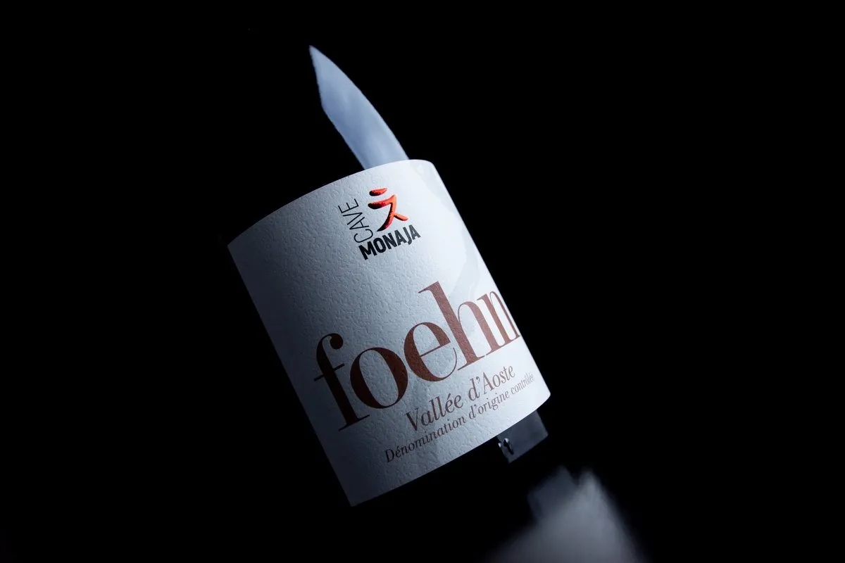
A logo is often one of the first assets designed for a new business, yet it’s difficult to predict all the contexts in which it will appear. A wine brand, for example, must ensure that its logo looks just as good on bottle labels as it does in catalogs or online.
A truly effective logo is versatile and legible everywhere — on business cards, large trade-show banners, or small promotional items like pins or tags.
Be cautious with overly small details that may disappear in print, or with color gradients that could blur or fade on certain materials.
The more adaptable and scalable a logo is, the easier it will be to repurpose and sustain it over time.

(Example: Sorgo Palace, where the logo stands out clearly and recognizably on the label.)
4. Storytelling Without Overexposure
A great logo can reveal a lot with very little. It should encapsulate the essence of a brand — its history, values, and mission — in a single visual statement. A small arrow can symbolize speed; a tree with deep roots can evoke heritage and tradition.
To achieve that, the designer must understand the brand’s story and values in depth. When crafted with intention, even the simplest symbol can express a company’s entire identity — its operations, vision, and purpose.
A classic example is Amazon’s logo: clean, linear, with a smile-shaped arrow from A to Z — a visual metaphor for the platform where you can buy everything, quickly and efficiently.
5. Stand Out — and Stay Remembered
If the logo is the brand’s first impression on the world, it must be designed to stand out and be remembered. It should be distinctive, engaging, and trustworthy — never generic or derivative. Copying existing logos can seriously damage a brand’s reputation, making it appear unoriginal and uninspired.
A unique shape or outline is often what makes a logo truly recognizable. Start with a strong, defining form — sharp and precise — and then refine it with the right color palette, typography, and supporting design elements.
The goal is simple: a logo that’s unique, cohesive, and unmistakably yours.
Designing a logo isn’t just about software or technique — countless apps can help with that. The true value lies in the creative process: distilling a story, a vision, a dream into one powerful image.
That’s why it’s often worth trusting a professional — someone who can translate an idea into a symbol that lasts.
This site is protected by Google reCAPTCHA v3, Privacy Policy and Terms of Service.